--
:
--
:
--
配置打赏功能
最后更新于:
配置打赏功能
2025年1月15日已解决。
次功能由《Hydoc的小站》前端大佬贡献,感谢大佬。💖💖
环境
自己开源的 《vuepress-theme-vdoing-one-public》网站模板。
此模板是在Young Kbt blog的开源项目《Kele-Bingtang.github.io》基础上修改为自己的风格而成,感谢大佬开源的模板&感谢原作者开源的vdoing主题。❤️❤️
借鉴
原文章链接:
https://wiki.eryajf.net/pages/2e6f3a/
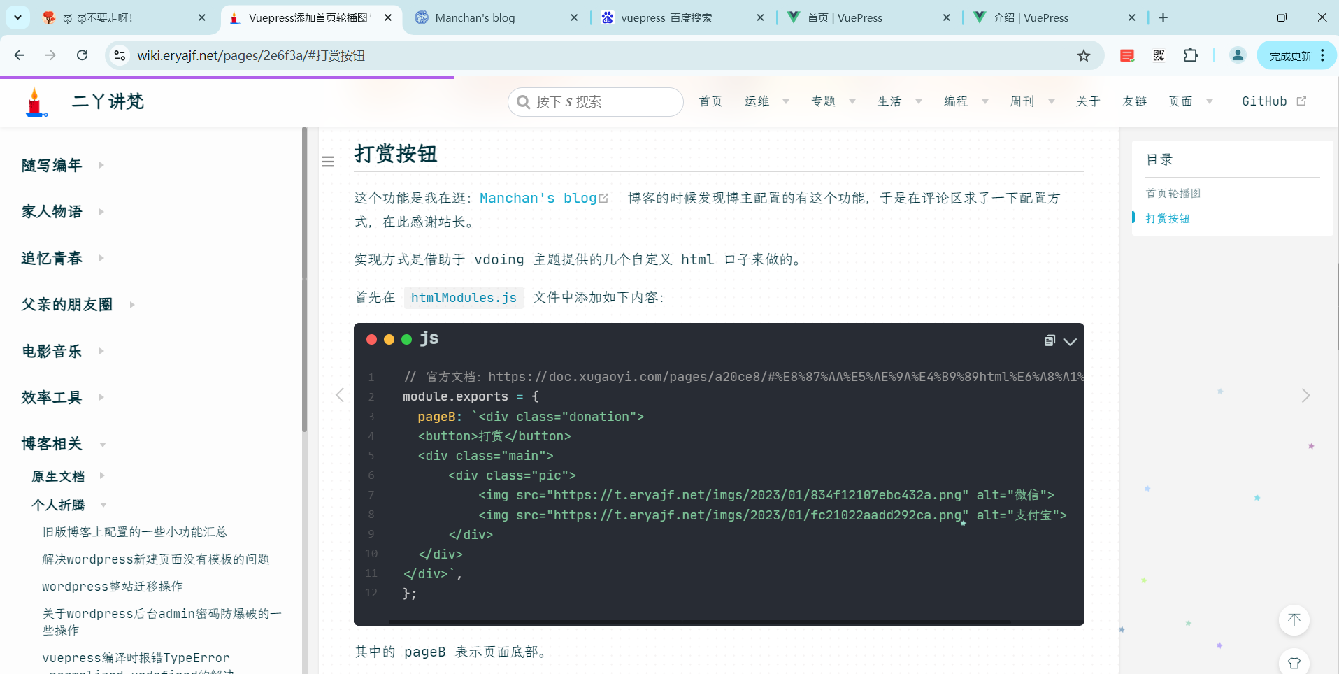
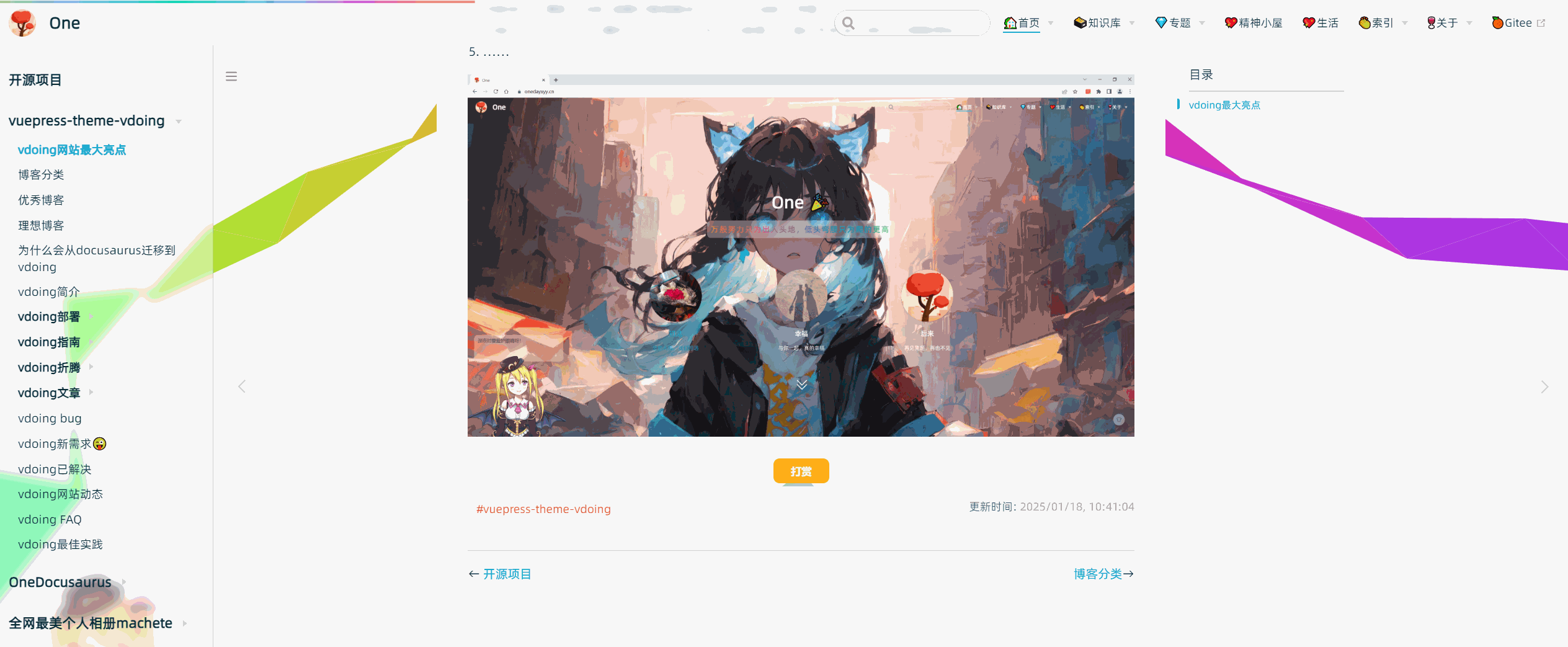
作者的效果:
配置
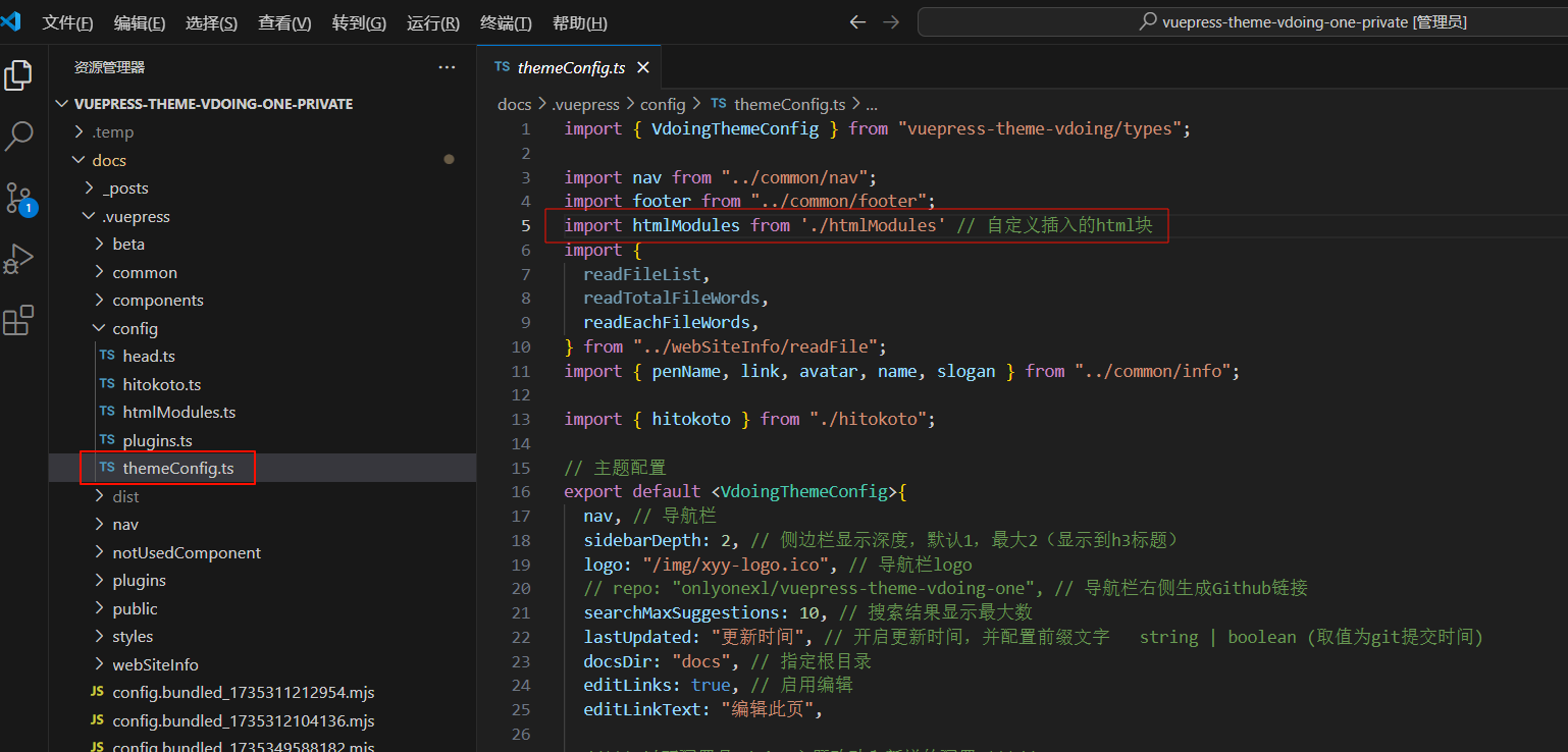
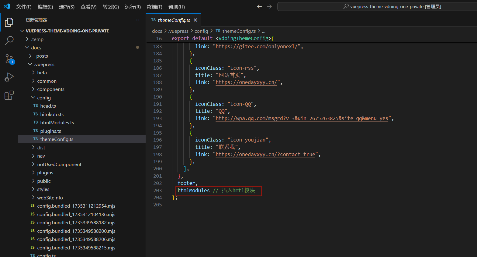
docs\.vuepress\config\themeConfig.ts文件:
完整代码:
详情
docs\.vuepress\config\htmlModules.ts文件:
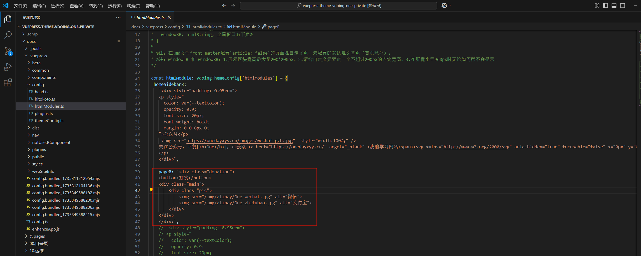
完整代码:
详情
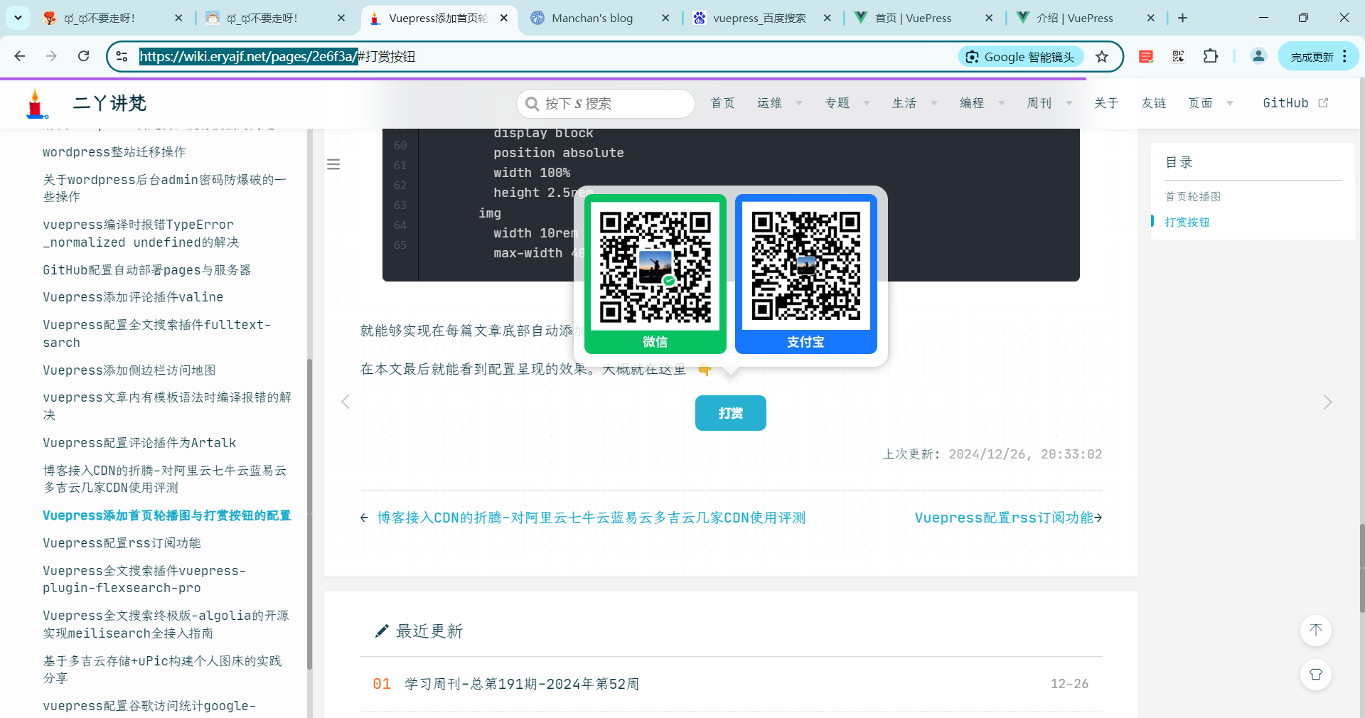
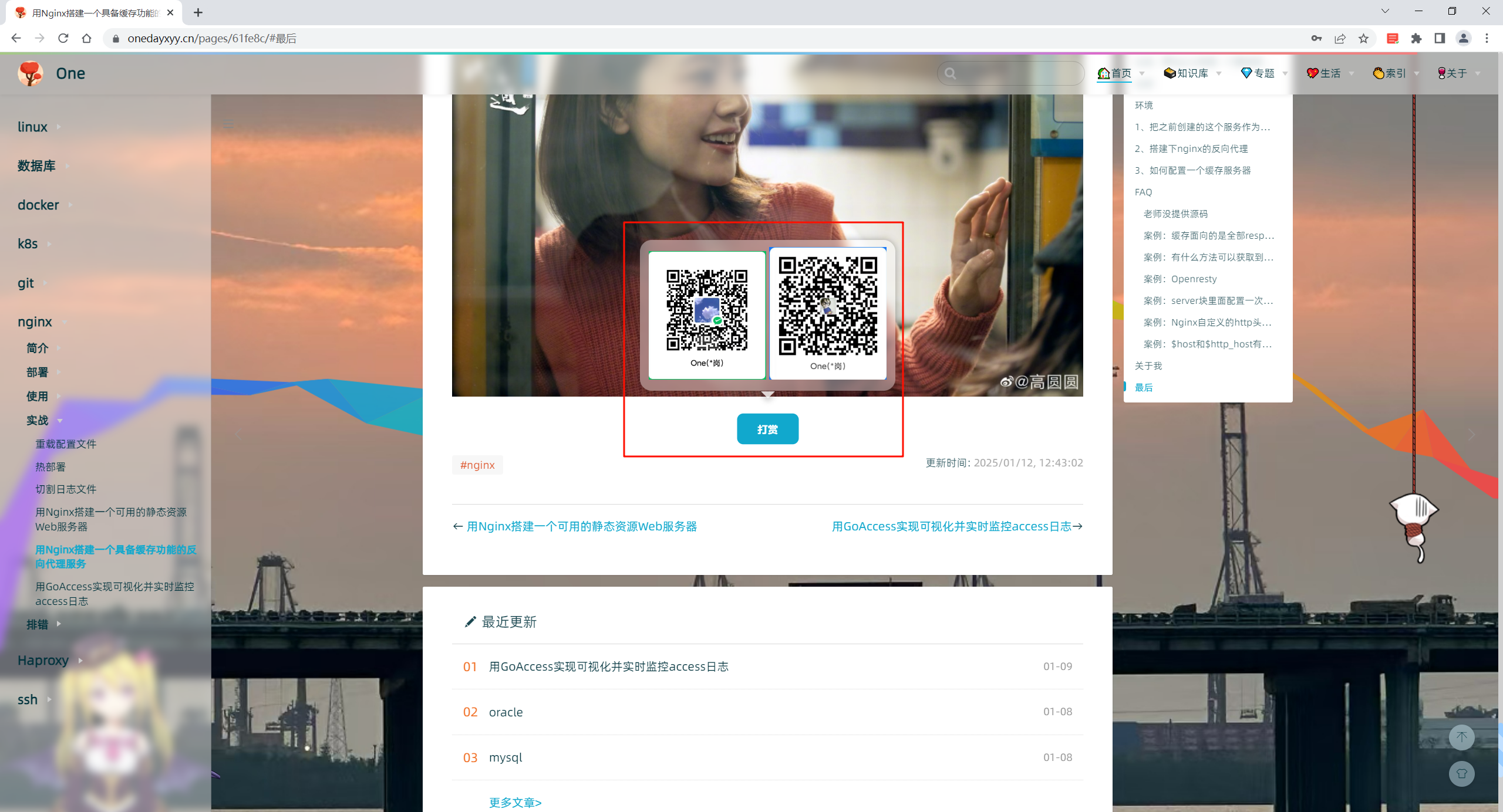
预览
每篇文章尾部都会出现这个赞赏功能哦。
配置赞赏流线边框按钮
2025.2.15(已解决)
环境
自己开源的 《vuepress-theme-vdoing-one-public》网站模板。
此模板是在Young Kbt blog的开源项目《Kele-Bingtang.github.io》基础上修改为自己的风格而成,感谢大佬开源的模板&感谢原作者开源的vdoing主题。❤️❤️
版权
次配置来源于《Hyde Blog》大佬贡献的代码,原文为《流线边框按钮》十分感谢。
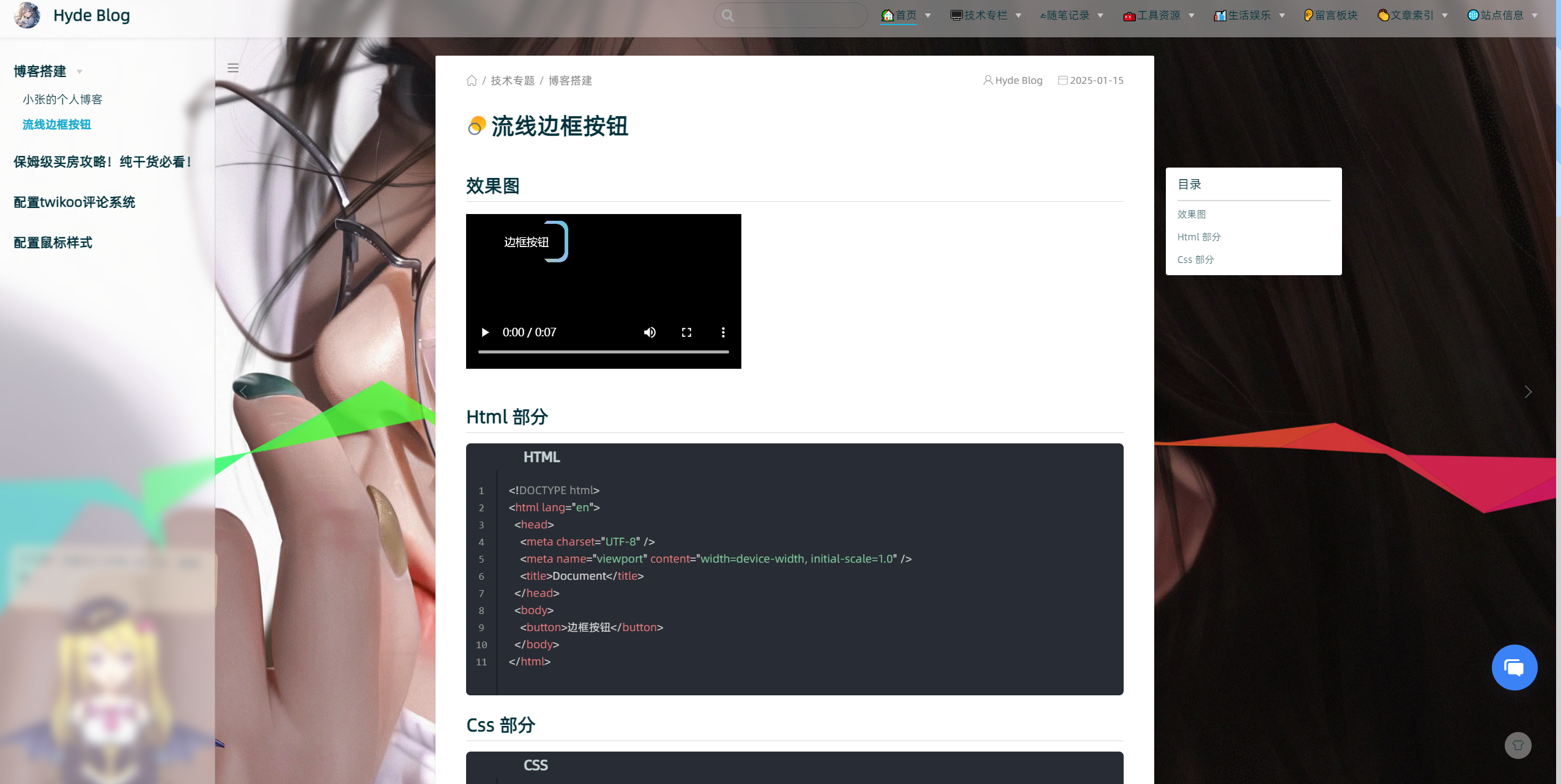
预览
配置
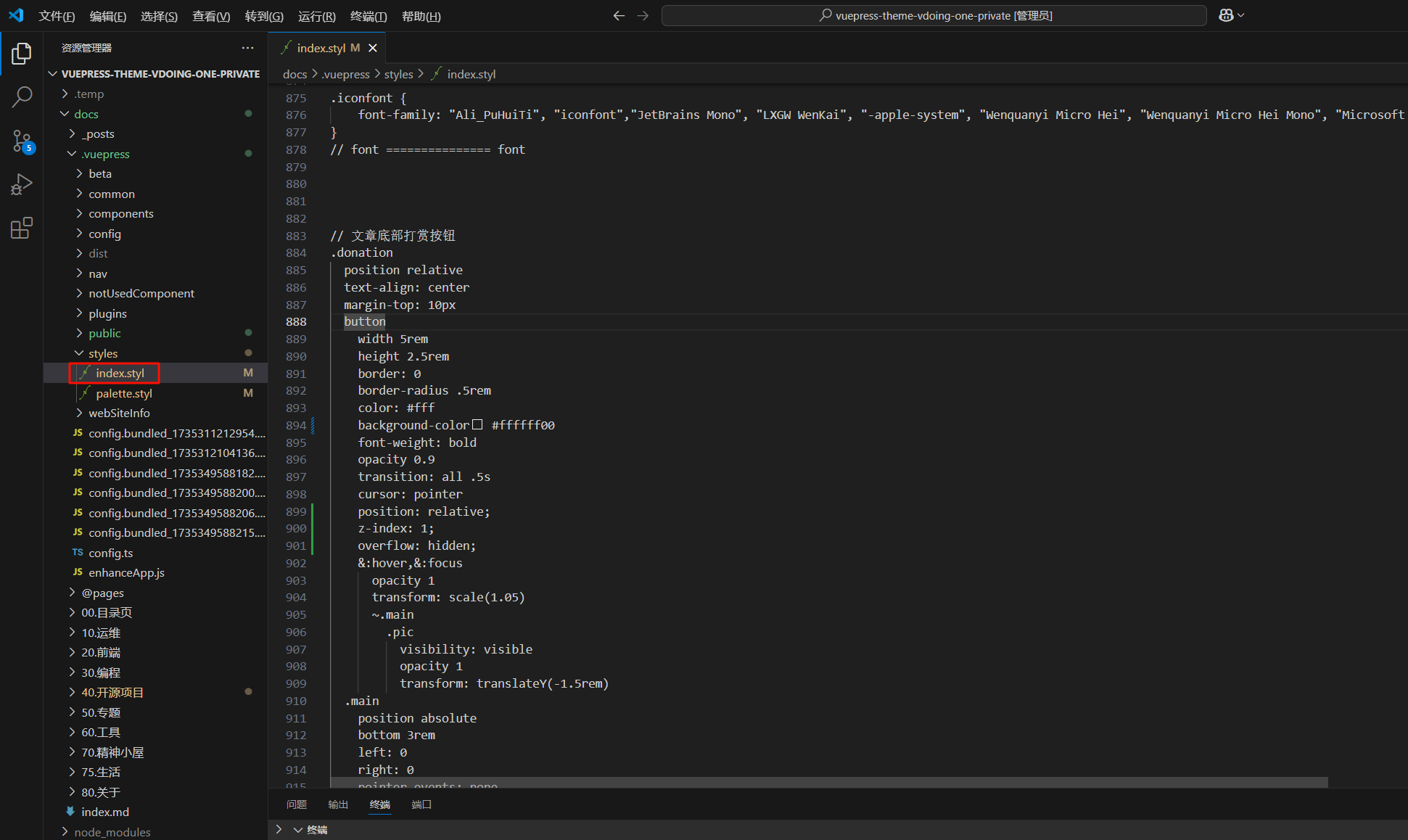
配置docs\.vuepress\styles\index.styl文件,在最后添加如下代码:
  1// 文章底部打赏按钮
  2.donation
  3  position relative
  4  text-align: center
  5  margin-top: 10px
  6  button
  7    width 5rem
  8    height 2.5rem
  9    border: 0
 10    border-radius .5rem
 11    color: #fff
 12    background-color #ffffff00
 13    font-weight: bold
 14    opacity 0.9
 15    transition: all .5s
 16    cursor: pointer
 17    position: relative;
 18    z-index: 1;
 19    overflow: hidden;
 20    &:hover,&:focus
 21      opacity 1
 22      transform: scale(1.05)
 23      ~.main
 24        .pic
 25          visibility: visible
 26          opacity 1
 27          transform: translateY(-1.5rem)
 28  .main
 29    position absolute
 30    bottom 3rem
 31    left: 0
 32    right: 0
 33    pointer-events: none
 34    .pic
 35      position relative
 36      visibility hidden
 37      display: inline-block
 38      padding:10px 12px
 39      background-color:#fff6
 40      backdrop-filter: blur(6px);
 41      box-shadow: 0 0 10px 0 #3336
 42      border-radius: 1rem
 43      opacity 0
 44      transition: all .5s
 45      pointer-events: all
 46      z-index 10
 47      &:hover
 48        visibility visible
 49        opacity 1
 50        transform: translateY(-1.5rem)
 51      &::before
 52        content: ''
 53        position absolute
 54        bottom -@padding[0]
 55        left: 50%
 56        right: 50%
 57        filter: drop-shadow(0px 4px 4px #3336);
 58        transform: translateX(-50%)
 59        border-width: (-@bottom) (-@bottom) 0;
 60        border-style: solid;
 61        border-color: rgba(#fff,.8) transparent transparent;
 62      &::after
 63        content: ''
 64        display block
 65        position absolute
 66        width 100%
 67        height 2.5rem
 68      img
 69        width 10rem
 70        max-width 40vw
 71
 72.donation button::before{
 73    content: ''
 74    position: absolute
 75    width: 200%;
 76      height: 200%;
 77      background: linear-gradient(
 78        114.2deg,
 79        rgba(184, 215, 21, 1) -15.3%,
 80        rgba(148, 187, 233, 1) 14.5%,
 81        rgba(21, 215, 182, 1) 38.7%,
 82        rgba(129, 189, 240, 1) 58.8%,
 83        rgba(219, 108, 205, 1) 77.3%,
 84        rgba(240, 129, 129, 1) 88.5%
 85      );
 86      z-index: -2;
 87      left: 50%;
 88      top: 50%;
 89      transform-origin: left top;
 90      animation: rotation 4s linear infinite;
 91}
 92 @keyframes rotation {
 93      to {
 94        transform: rotate(360deg);
 95      }
 96}
 97.donation button::after {
 98      content: "";
 99      position: absolute;
100      inset: 4px;
101      /* 设置边距 */
102      background:#FFA500;
103      z-index: -1;
104      border-radius: inherit;
105}
📡
推荐使用微信支付

推荐使用支付宝